The Power of a Logo: How to Craft a Timeless Brand Symbol That Actually Matters
A logo isn’t just a design—it’s your brand’s identity in a nutshell. Learn how to create a timeless logo that resonates, builds trust, and turns heads.
Date
2025
Category
Branding & Marketing

Contact Us
Let’s cut to the chase: most logos are boring. They’re generic, forgettable, and look like they were designed on a lunch break. But a great logo? That’s branding gold. It’s the visual equivalent of a mic drop—simple, bold, and unforgettable. Think Apple’s bitten apple or Nike’s swoosh. Those logos don’t just say, “Hey, we exist.” They scream, “We’re here to own this space.” If your logo isn’t doing the heavy lifting for your brand, don’t worry. This guide is your brutally honest wake-up call on why logos matter, what makes them great, and how to know if yours is doing its job.
Why Your Logo Matters (Hint: It’s Not Just Decoration)
Your logo is more than a doodle on your website or a sticker on your product. It’s your brand’s face. People see it before they know anything about you, and they’ll judge your business in milliseconds based on that impression.
Examples:
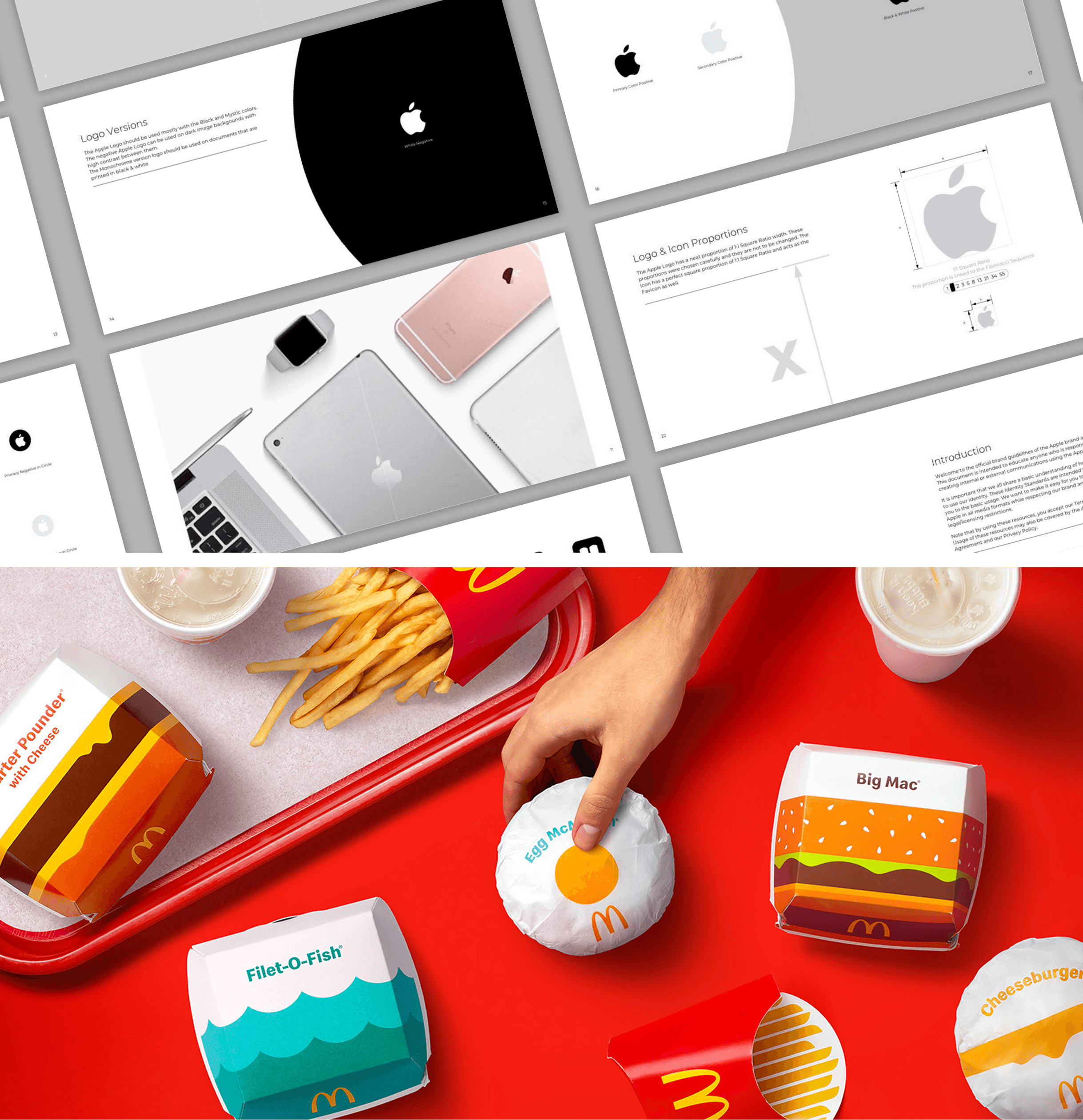
Apple’s logo? A minimalist masterpiece that screams innovation.
McDonald’s golden arches? They’ve been making you crave fries for decades.
Here’s why your logo is mission-critical:
Instant Recognition: Think of Nike. The swoosh doesn’t need words—it’s shorthand for “Just Do It.”
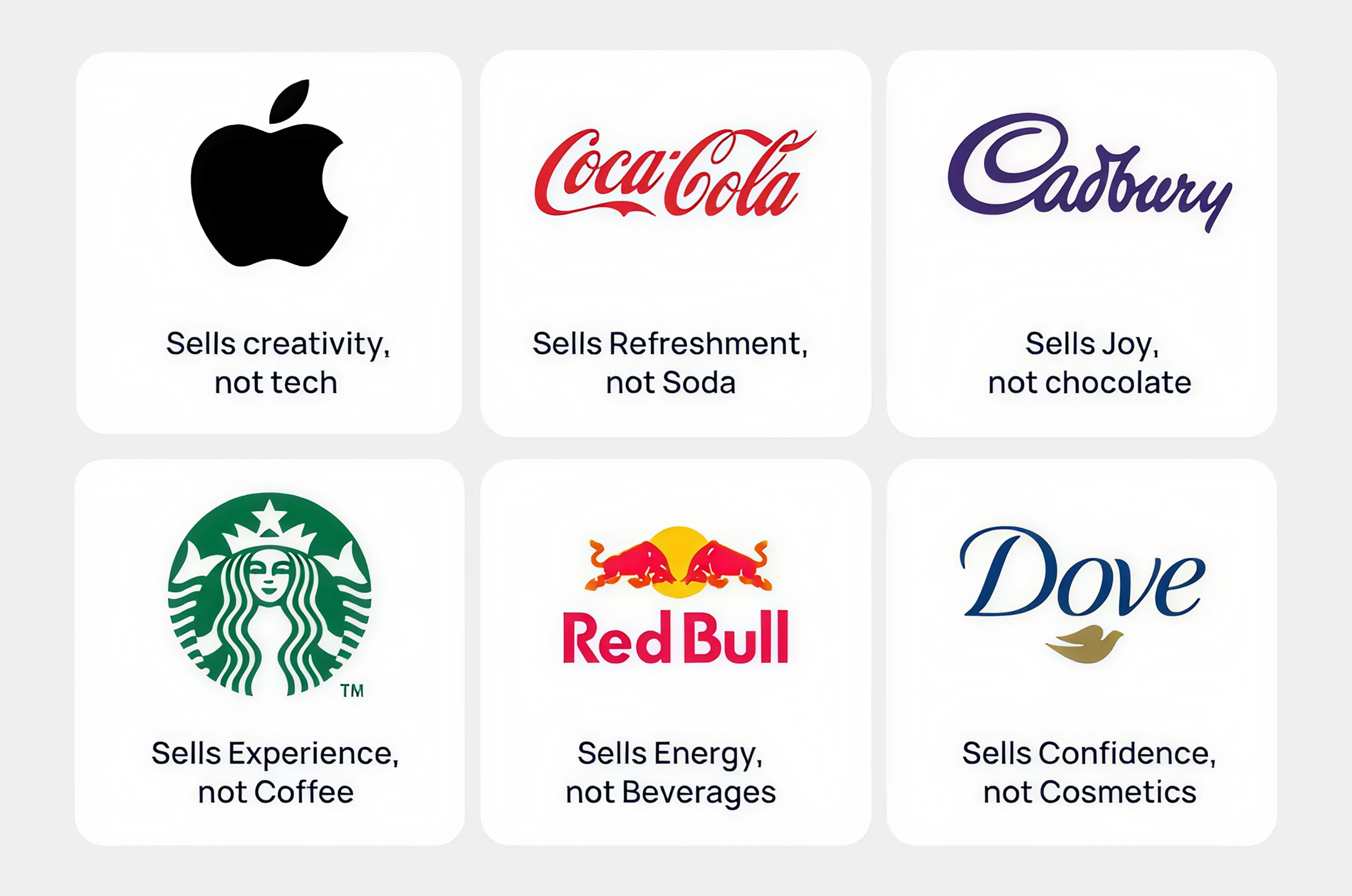
Brand Loyalty: The more people associate your logo with positive experiences (Coca-Cola, anyone?), the more they trust you.
Consistency Everywhere: From business cards to TikTok, your logo ties your brand together like duct tape—reliable and everywhere.
First Impressions: No one takes a shabby logo seriously. A professional design says, “We mean business,” not “We just started yesterday.”
Pro Tip: If your logo doesn’t make people feel something (trust, curiosity, hunger), it’s time for a rethink.
What Makes a Great Logo? (Spoiler: It’s Not About Being Fancy)
Creating a killer logo isn’t rocket science, but it does take more than picking a font and a color. Let’s break it down:
1. Simplicity: Because Nobody Likes Overcomplicated Nonsense
The best logos are like good tweets—short, impactful, and to the point.
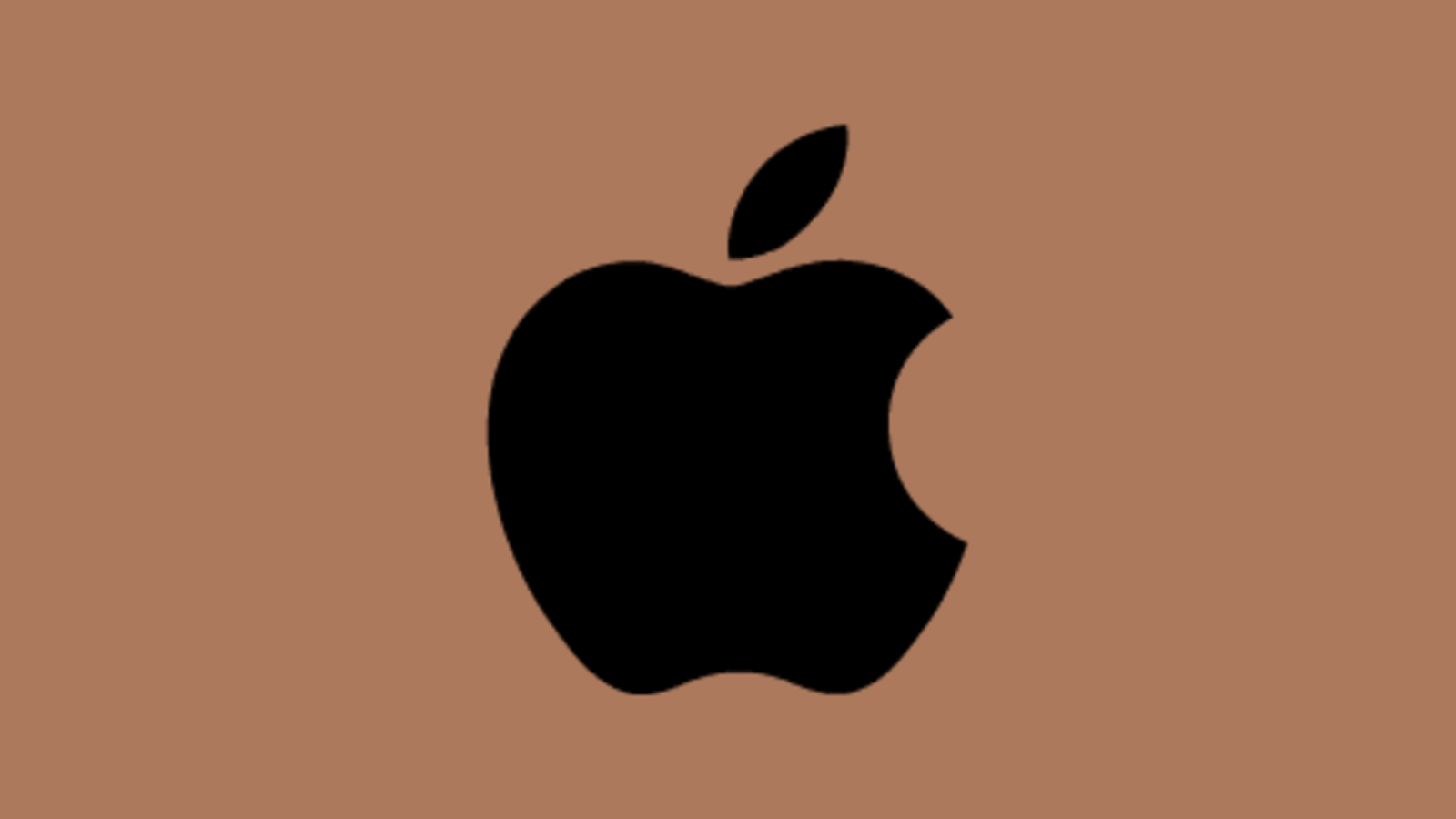
Example: Apple’s bitten apple. It’s so simple you could sketch it on a napkin, but it still oozes creativity and sophistication.
Pro Tip: If your logo looks like it belongs on a 3rd-grade art project, simplify it. Think “clean and iconic,” not “busy and confusing.”
2. Timelessness: Don’t Be a Victim of Design Trends
Trendy logos are like 2010’s skinny jeans—they age badly. A timeless logo stays fresh no matter the decade.
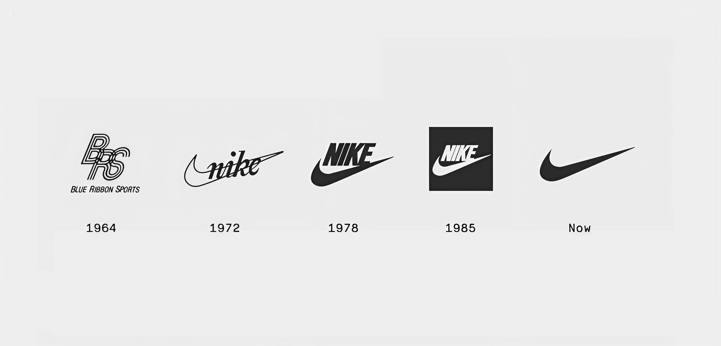
Example: Nike introduced the swoosh in 1972. Fifty years later, it still dominates. Why? Because they didn’t slap on trendy gradients or 3D effects.
Pro Tip: Avoid gimmicks. If it wouldn’t look good in black and white, it’s not timeless.
3. Versatility: Your Logo Should Look Good Everywhere (Even Tiny)
Your logo needs to shine on everything from a billboard to a thumbnail on Instagram.
Example: Twitter’s bird works beautifully at any size. You see it, you know it.
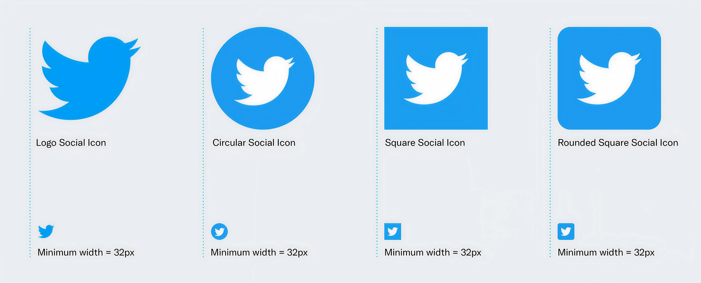
Pro Tip: Test your logo in different formats. Shrink it, flip it, slap it on different backgrounds. If it breaks under pressure, it’s not versatile enough.
4. Relevance: It’s Not About You; It’s About Your Audience
Your logo needs to reflect your brand’s vibe and make sense to your customers.
Example: Dropbox keeps it simple and approachable with a geometric box icon, signaling organization and tech-savvy solutions.
Pro Tip: Don’t be clever for the sake of it. If you’re a law firm, your logo shouldn’t look like a skateboard company’s.
5. Uniqueness: Stand Out or Be Ignored
In a sea of lookalike logos, yours needs to turn heads.
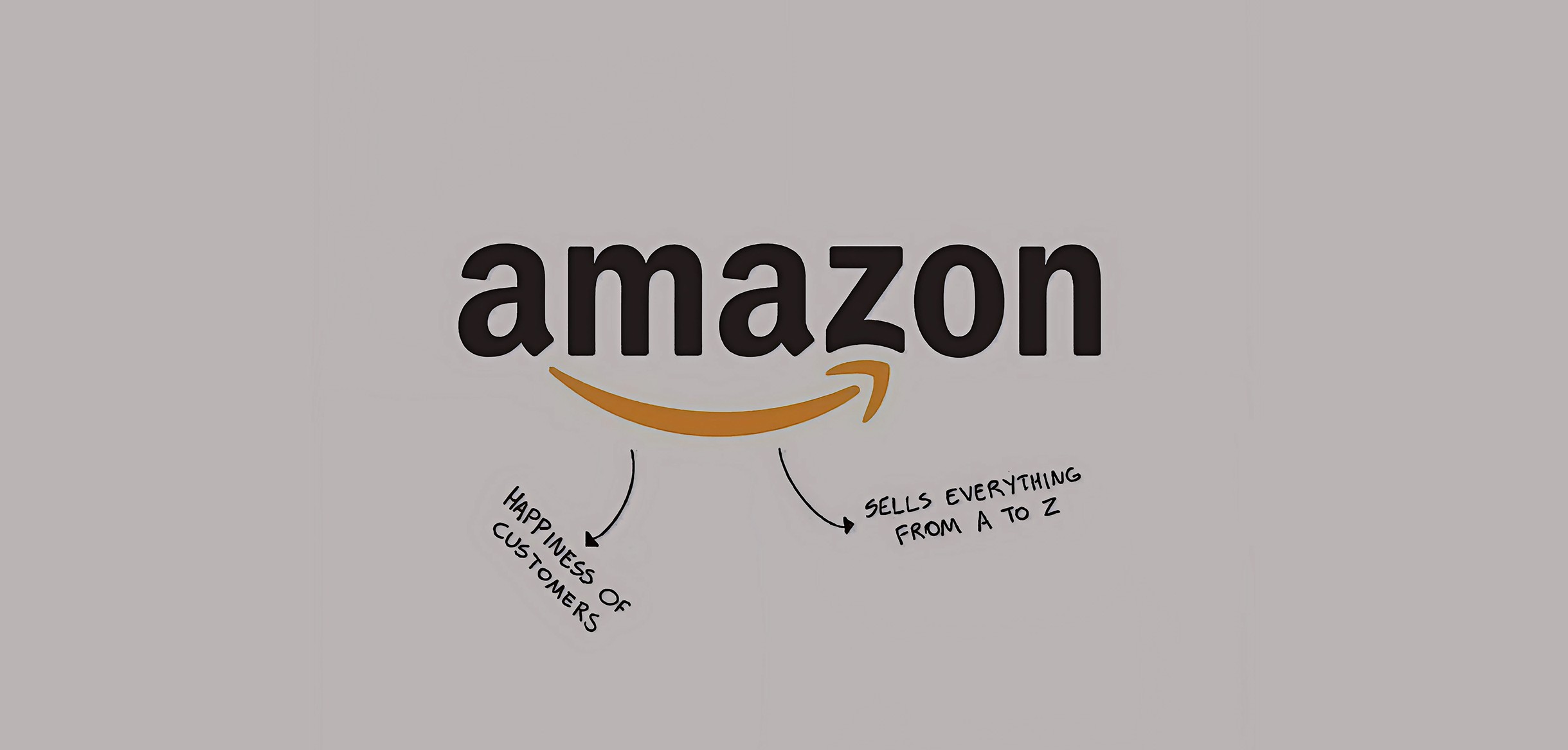
Example: Amazon’s logo includes a smiley arrow connecting A to Z, subtly telling customers they have everything you need—and making you feel good about shopping there.
Pro Tip: Check out your competitors’ logos and do something different. If their logos are round, go angular. If they’re muted, go bold.
How to Know If Your Logo Is Actually Good
Let’s be brutally honest—some logos just don’t cut it. Here’s how to tell if yours is a keeper:
Is It Memorable?
If people can’t remember your logo after seeing it once, it’s time for a redesign.
Test it: Show it to someone for five seconds. Can they draw it from memory?Does It Reflect Your Brand?
Your logo should scream your brand’s essence. If you’re running a luxury spa, your logo better not look like a fast-food joint’s.Is It Timeless?
Does it look like it belongs in 2023, 1993, and 2053? If not, it’s a trend victim.Is It Versatile?
If your logo collapses under pressure (like a bad Zoom connection), it’s time for a redesign.Is It Simple?
Clutter kills logos. Strip it down to the essentials and let the design breathe.


